Thanks to Thomas Powell for this help on this article.
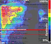
Did you know the most heavily used button in a web browser is the back button? It’s usually on the top left of your screen.
If you believe people look where they point, users cross that upper-left corner of the screen quite a bit.
Do you use this insight in your web design?
Google “Heat Map Golden Triangle” and you’ll find a lot on the topic and its implication on effective web design. An Eyetools post (no longer available) was the original that spawned a thousand mentions.
Thomas Powell, web agency CEO, author of numerous Web development books, and mentor of mine, thinks the article overemphasizes one the finding because of the design of the Google search list result.
You can easily draw all sorts of conclusions if you don’t think carefully about the division between inherent gaze/attention and design influence gaze/attention. To wit, a Web professional at Chico State suggests the golden triangle theory doesn’t hold for the school’s site. Thomas responds,
Unfortunately Chico’s conclusion does not debunk the golden triangle pattern observed by Google and reinforced by Jakob Nielsen.
In some sense Chico’s very design forces attention on the right side because they put primary navigation items on the right of the screen for heavy site users (such as current students and staff) and the left is populated with infrequent items for, say, prospective students.
If they performed their tests with the sampling of just prospective students they’d get a different result.
Further, Chico’s heat map is a click map – not a gaze map. They are related but not the same. You’d very likely see a gaze in upper left at first before a quick move to the right since theirs are largely western and top-bottom left-right accustomed visitors.
Unfortunately, many heat map studies are not clear in what they are studying! But most do reinforce the golden triangle idea. Here is a snapshot from Dana Todd’s Eye Tracking Study.
You can see the expected left-right read pattern, though one that shows many visitors bailout early.
Despite these studies, Powell thinks people may overemphasize the effect of the golden triangle.
“There are two things going on in gaze and attention, the first is the pre-programmed top-bottom, left-right pattern the golden triangle clearly shows and the second is the gaze, based upon attractors.
Consider the Chico example. Attention will likely change with position of frequently used items. Generally attention shifts to items that are frequently used, built to attract attention such as large images, animations, headlines and even the layout of content will effect attention patterns.” Thomas offered.
If you reconsider the newspaper layout, you can see Powell’s assertion may be self-fulfilling: Design reinforces the pattern.
Powell has little doubt the top-left is the most likely attention-starting point and adds, “Web sites would be wise to consider that valuable real estate, and use it to orient site users. Don’t just waste the space. However, the golden triangle is not absolute. Clear layout, interesting copy, and motivating imagery will be able to move users gaze beyond this area.”
In conclusion, the Golden Triangle is an important web design consideration. Work with the inherent pattern – not against it – and guide the user’s attention from this starting point to the conclusion we’d like them to reach.
Related: How can I rank for a term on Google?


